Achieve provides financial solutions for people struggling with debt. As lead designer on a newly formed team, I led the redesign of our enrollment flow from a static, multi-step form into an AI-first, agentic experience. My contribution: turning research into interaction design, information architecture, and informing the agent's behavior.
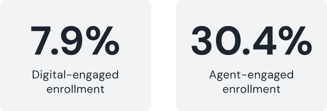
There are two paths to enroll in the debt relief program: digitally, or by talking to a live agent. Digital-only enrollment converted at 7.9%. Agent-engaged enrollment converted at 30.4% — nearly 4x higher. That gap was the whole reason this project existed: guidance, not just a better form, is what actually moves people to enroll.
The working theory — not yet proven — was that a conversational, adaptive system could do something a static form structurally can't: meet someone where they are, based on what they actually say.

I interviewed agents and parsed agent–client conversations using NotebookLM to map the natural stages of a debt-relief conversation and to find out where people consistently got confused — cost and fees, understanding interest, comparing options, and how the program works. Creating design solutions that made these aspects clearer became my design priority.
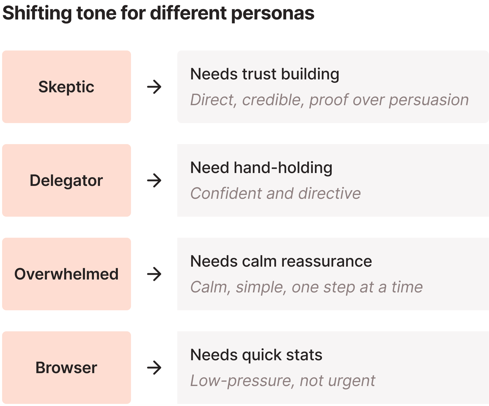
I also learned how agents shift tone depending on who's on the other end, and mapped that explicitly into a tone framework.
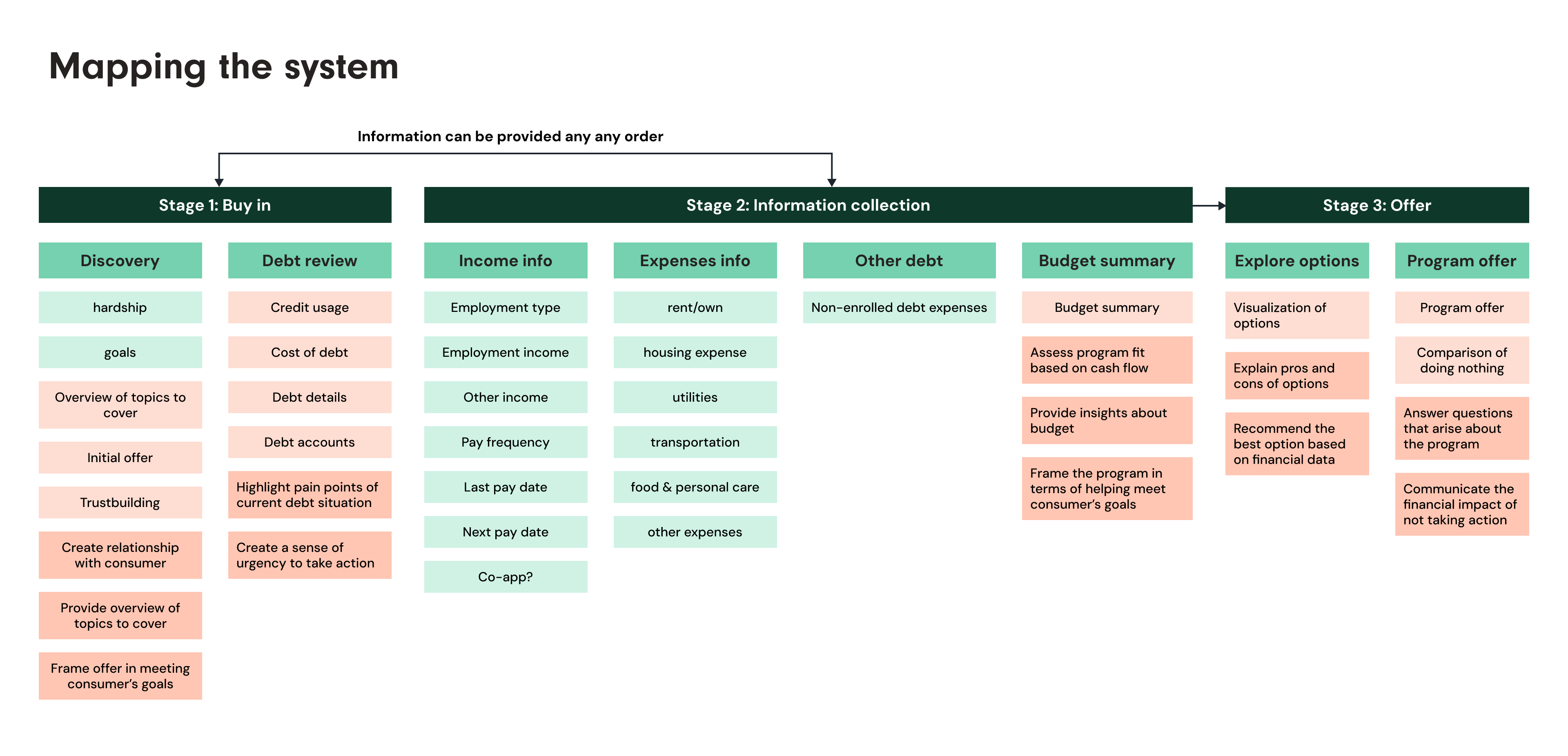
Mapping the system
This became the artifact that got PM, content, and engineering aligned: three stages — Buy-in, Information Collection, Offer — each annotated with what to collect, what to display, and an explicit agent goal at every step (build trust, create urgency, frame the offer around the user's own stated goal).
Redesigning how the offer is explained
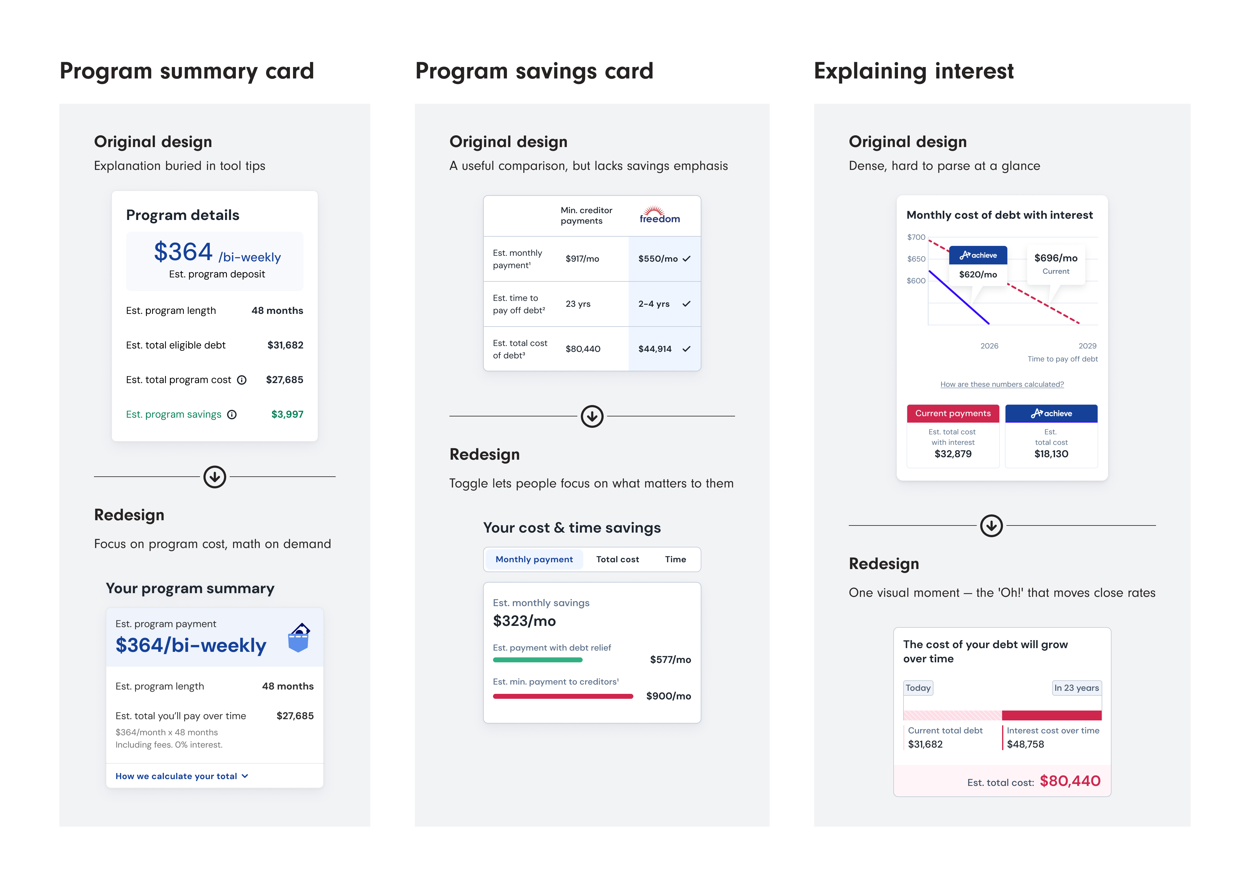
Designing for an agentic experience meant leaning heavily into componentized information. Because the agent decides what to surface and in what order, each piece of the interface had to hold up on its own — clear and complete regardless of what came before it. That put real pressure on individual components, and several went through multiple rounds before they shipped.
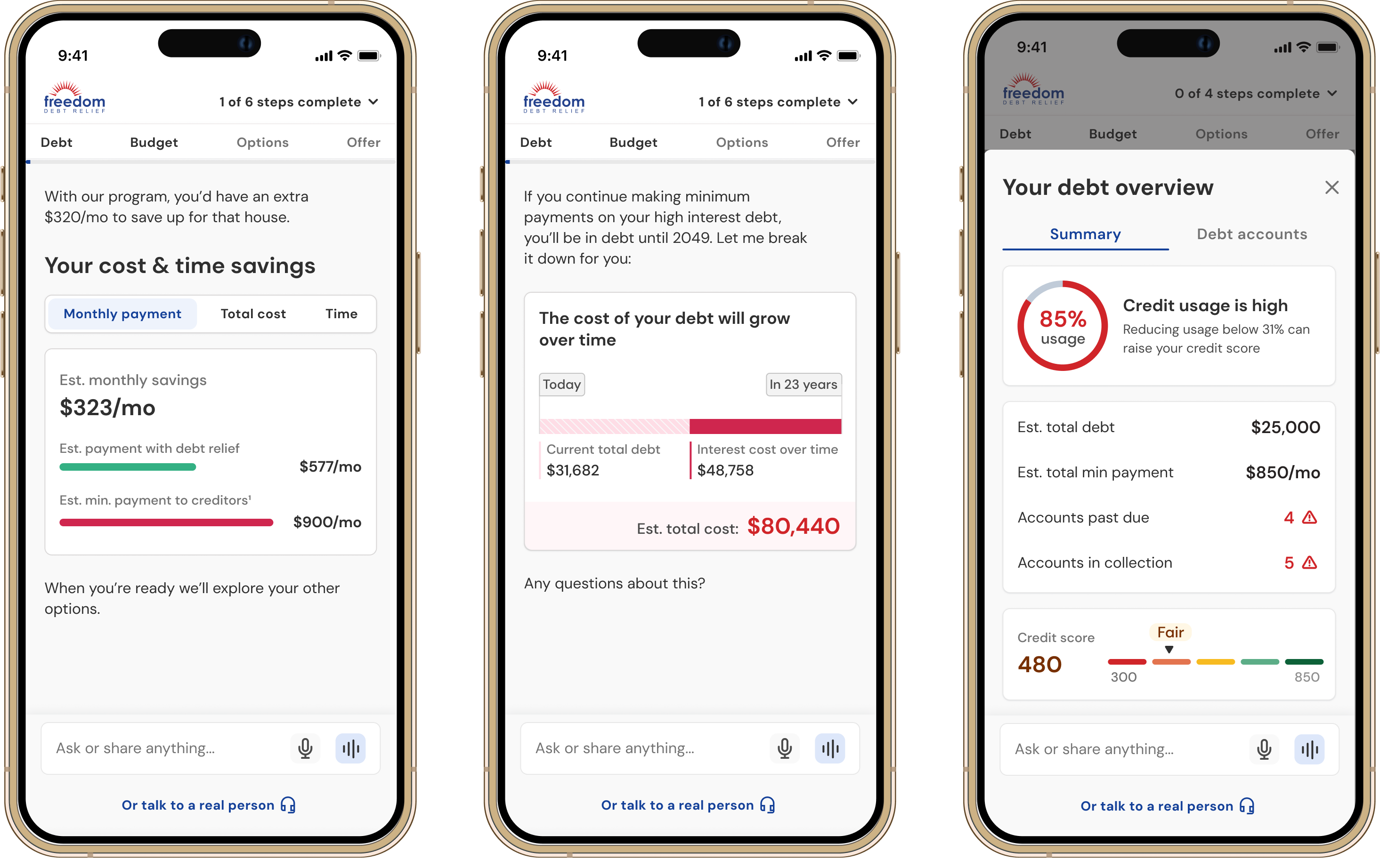
- The legacy program summary card often left people confused about program savings and cost. The redesign leads with the one number people care about most, with the full calculation available on demand instead of always on screen.
- For savings comparison, testing showed people scan for monthly payment first, so the version that shipped lets someone toggle between views instead of parsing all three at once.
- Explaining the cost of interest took the most iteration. Many versions had been attempted before mine — the version that shipped is a simple visual, but it's been one of the "Oh!" moments that's moving the needle on close rates.
A hypothesis that didn't survive
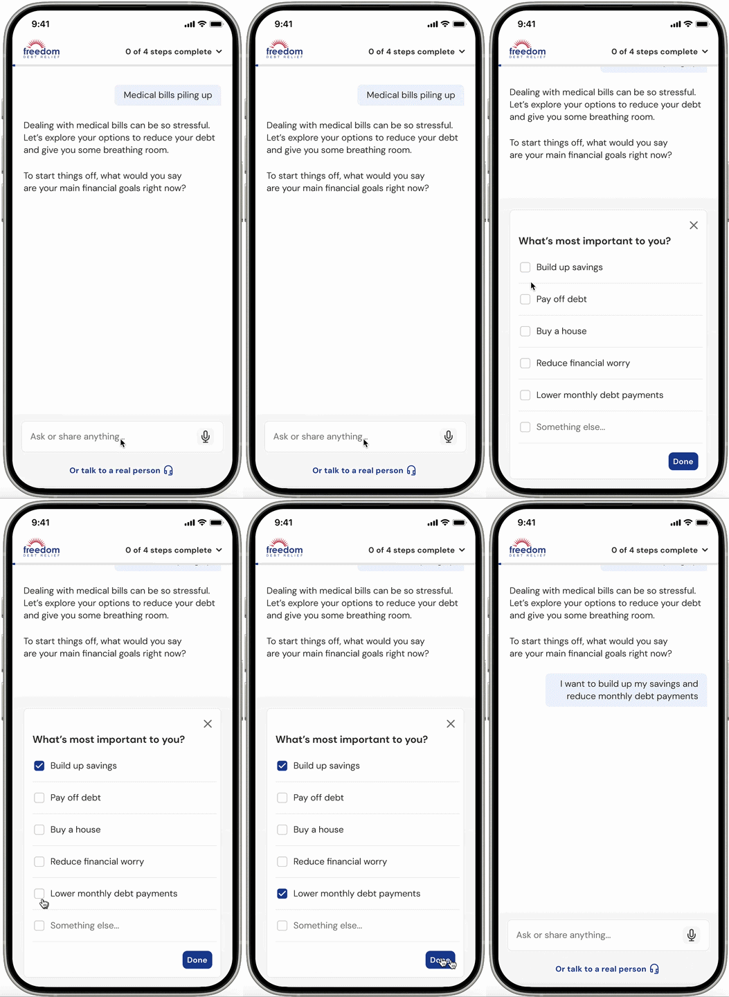
- The correction: stop treating "conversational" as the goal. Treat the AI as an adaptive guidance system — conversation is one tool among several.
- The design solution: move goal capture to a fast multi-select — query data showed goal answers clustered tightly and predictably — while deliberately keeping the hardship story (the emotionally loaded part) fully conversational.
Adding a navigation framework
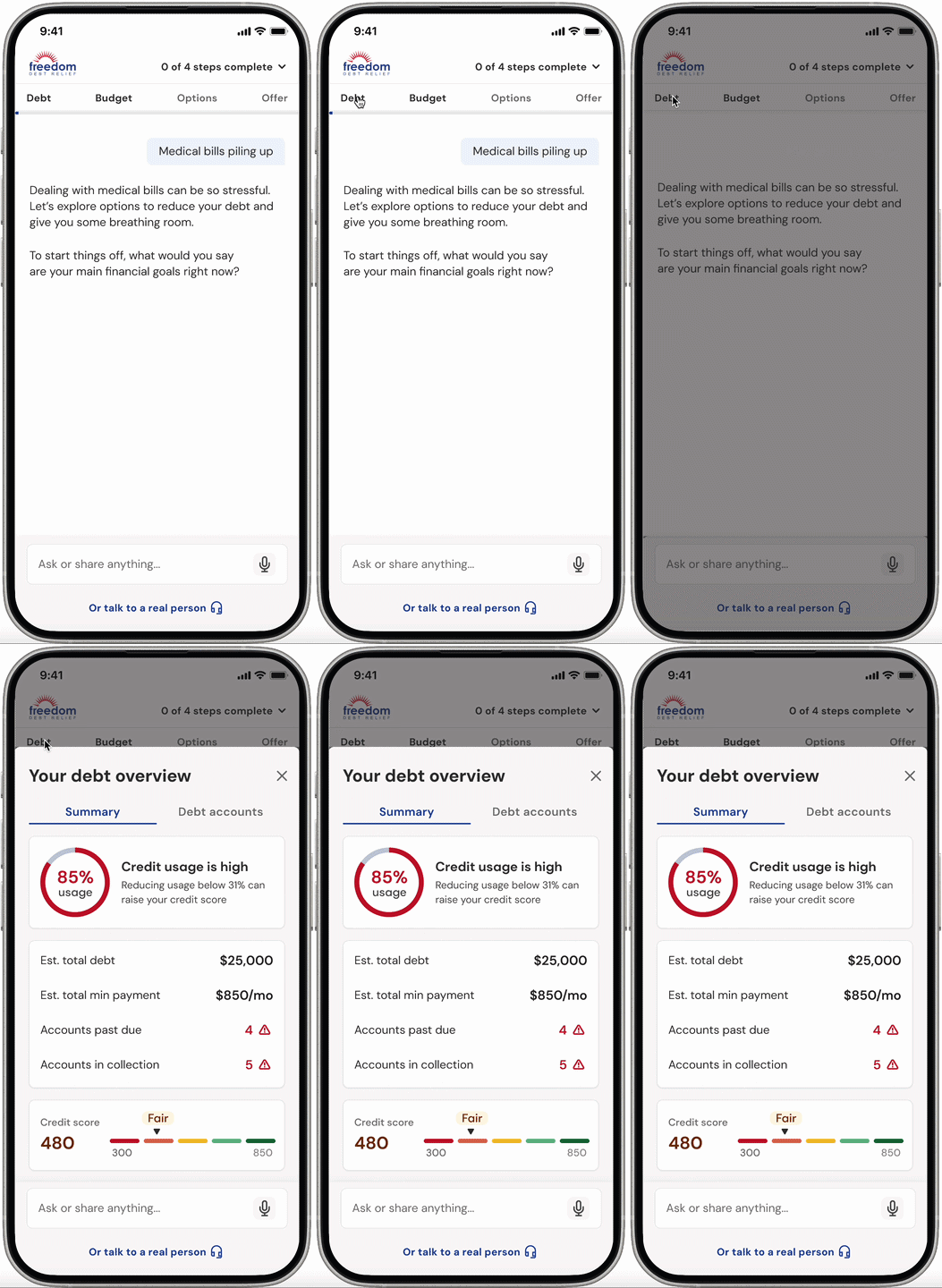
Two behaviors kept showing up in the data: people scrolling back through the conversation to find something they'd already said, and spouses who weren't part of the conversation needing a way to catch up — natural in a chat-based flow, but costly. I'd designed a fix for this earlier and it got cut from scope; the data brought it back. The in-session fix: a persistent subnav (Debt / Budget / Options / Offer) that lets someone jump straight to any part of what they'd already shared, without hunting back through chat history to find it.
An AI agent that knows when to show, not tell
The shipped experience translates what I learned from human agents directly into the AI's behavior: structure for predictable, low-variance questions, conversation reserved for moments that need empathy, objection handling, or reframing — the same judgment calls a skilled agent makes instinctively, made explicit enough for the AI to follow. A persistent "talk to a real person" link means no one is ever trapped in the chat.
An early positive signal
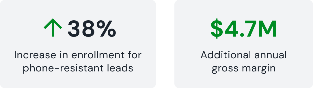
This is live at a limited rollout (3% of traffic), so it's not yet at statistical significance — but within that sample, phone-resistant leads are converting noticeably higher than baseline: a 38% increase in enrollment for that segment, which projects to roughly $4.7M in additional annual gross margin if it holds at scale.
The components built for this flow are now being reused across other teams' flows, including the landing page — if they lift conversion there too, the impact compounds beyond this one project. I'll update this page with confirmed results once the rollout scales.