A new way to loan shop

Achieve provides financial solutions for people struggling with debt. As lead designer on a newly formed team, I uncovered a powerful win-win opportunity—one that gives consumers what they want while significantly increasing sales potential for Achieve.
Current state of the experience
After joining a new team, I dug into the funnel metrics and was surprised by the 89% abandonment on the entry point for our flagship product. Users have to navigate five screens and enter sensitive PII before seeing any information about Achieve's rates or their offers.
This is an industry-standard approach.


Uncovering insights through user research
8 participants · 45-min moderated sessions · screened for active debt-management intent
Key insight
Before entering sensitive data, users want a ballpark of rates to judge whether continuing is worth their time and privacy risk.
“You have to sign up for everything to get an idea of what they’re offering you. I don’t love that.”
“In a perfect world, I’d love to be able to see the average rate for someone in your situation before being burdened by a bunch of creditor calls.”
The opportunity
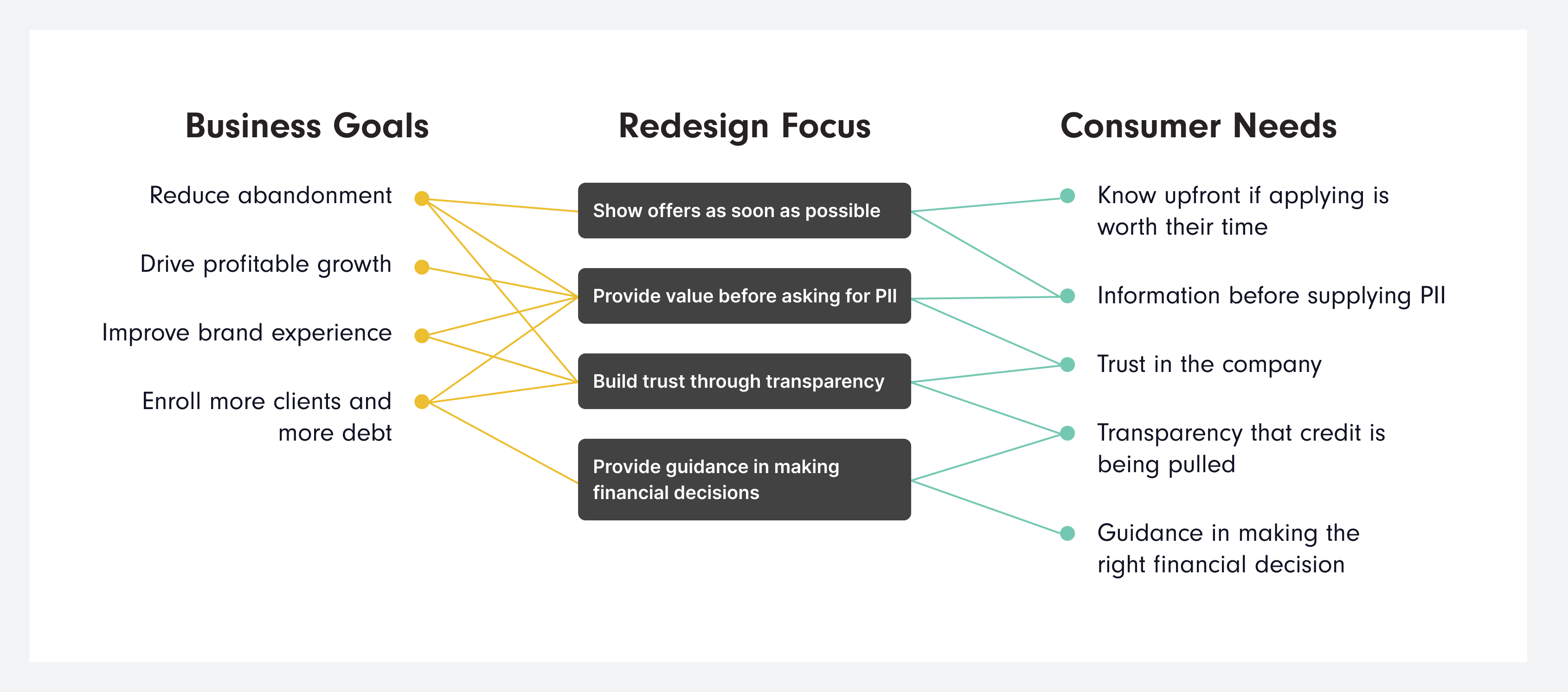
That told me there was a real opportunity here — not just a UX fix, but a business one. If we solve this, we can meet KPIs while solving a real problem for people.
Concept testing
I held a cross-functional brainstorming session around this and other pain points uncovered in the discovery research. Then, my junior designer and I developed a few concepts to run by our target audience.
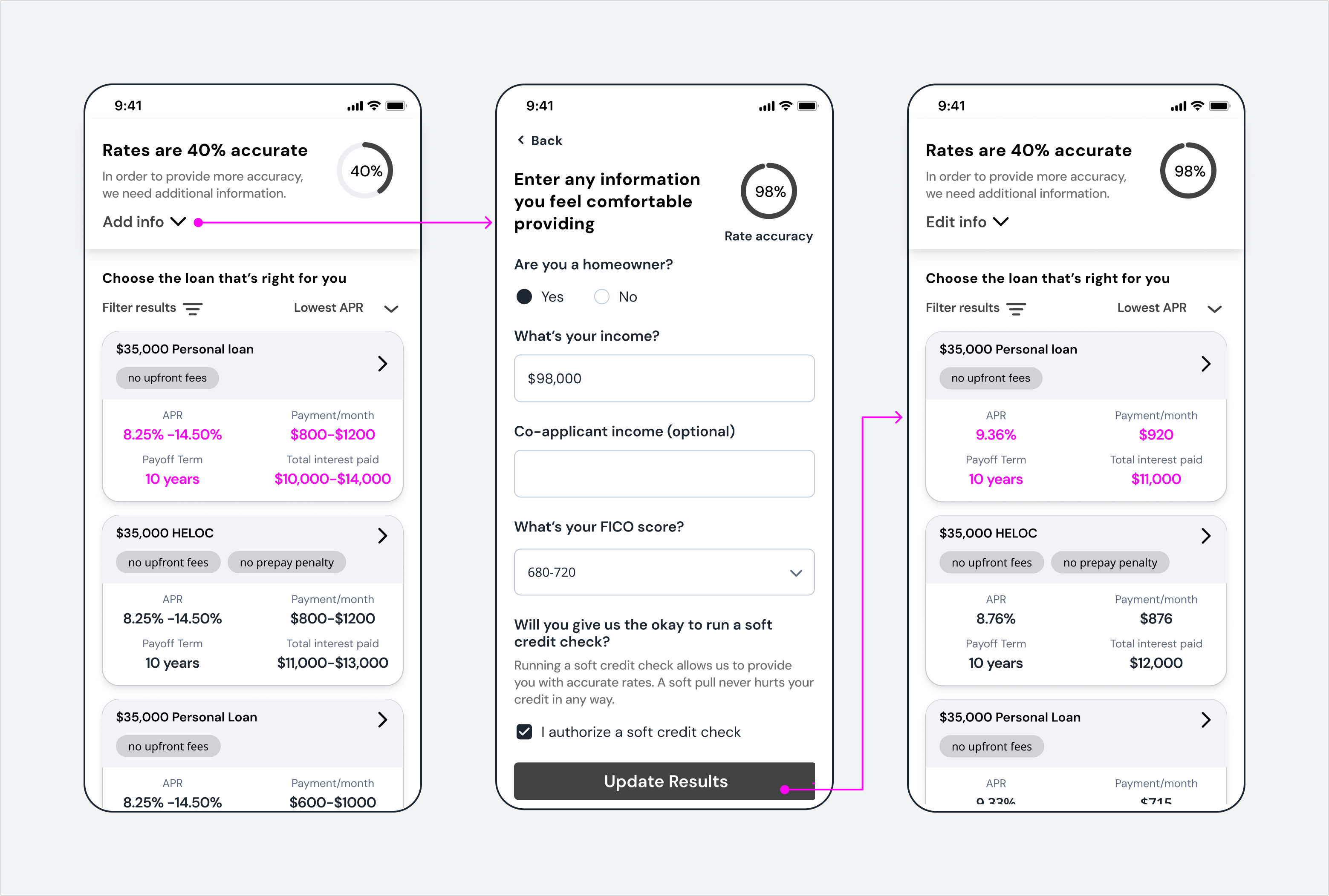
One idea I had was a tool that displays a rate ranges upfront without requiring PII, allowing users to refine results by providing self-stated financial info. 88% of participants voted this idea as the most valuable.
Usability testing
With such a positive signal, I began testing and refining the design.
A key hypothesis that didn’t survive:
- My assumption was that framing rate accuracy as the reason to share more info would motivate users to provide financial details.
- "Accuracy" framing actually caused confusion. Users intuitively understood the correlation with adding more info to refine the rate ranges.
A/B testing
Once I'd worked out the kinks, I conducted an A/B test of the current experience vs. this redesign. 90% preferred the new design. People found it easier to explore options, more trustworthy, friendlier, and were more inclined to provide PII because they understand the value in doing so.
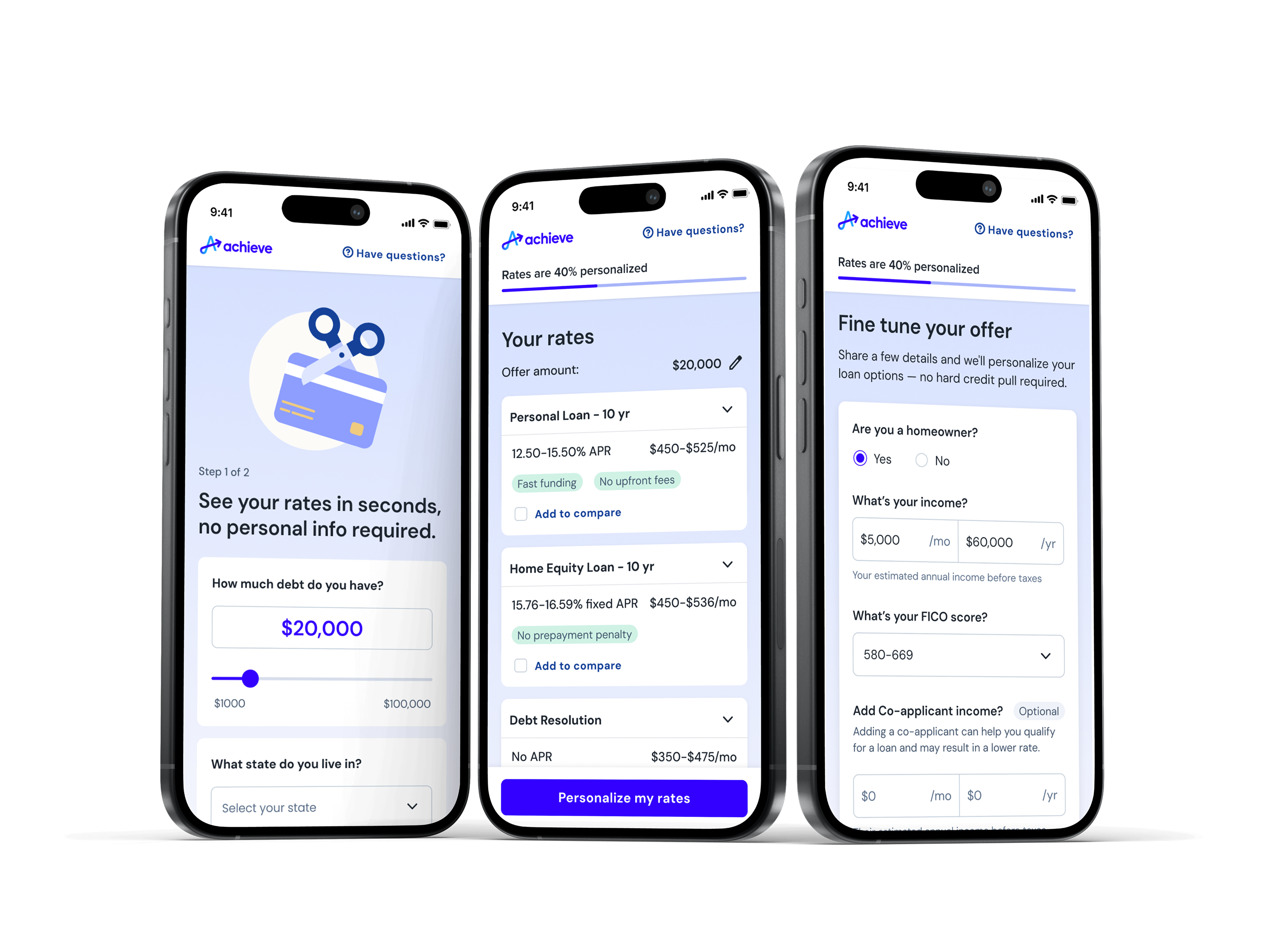
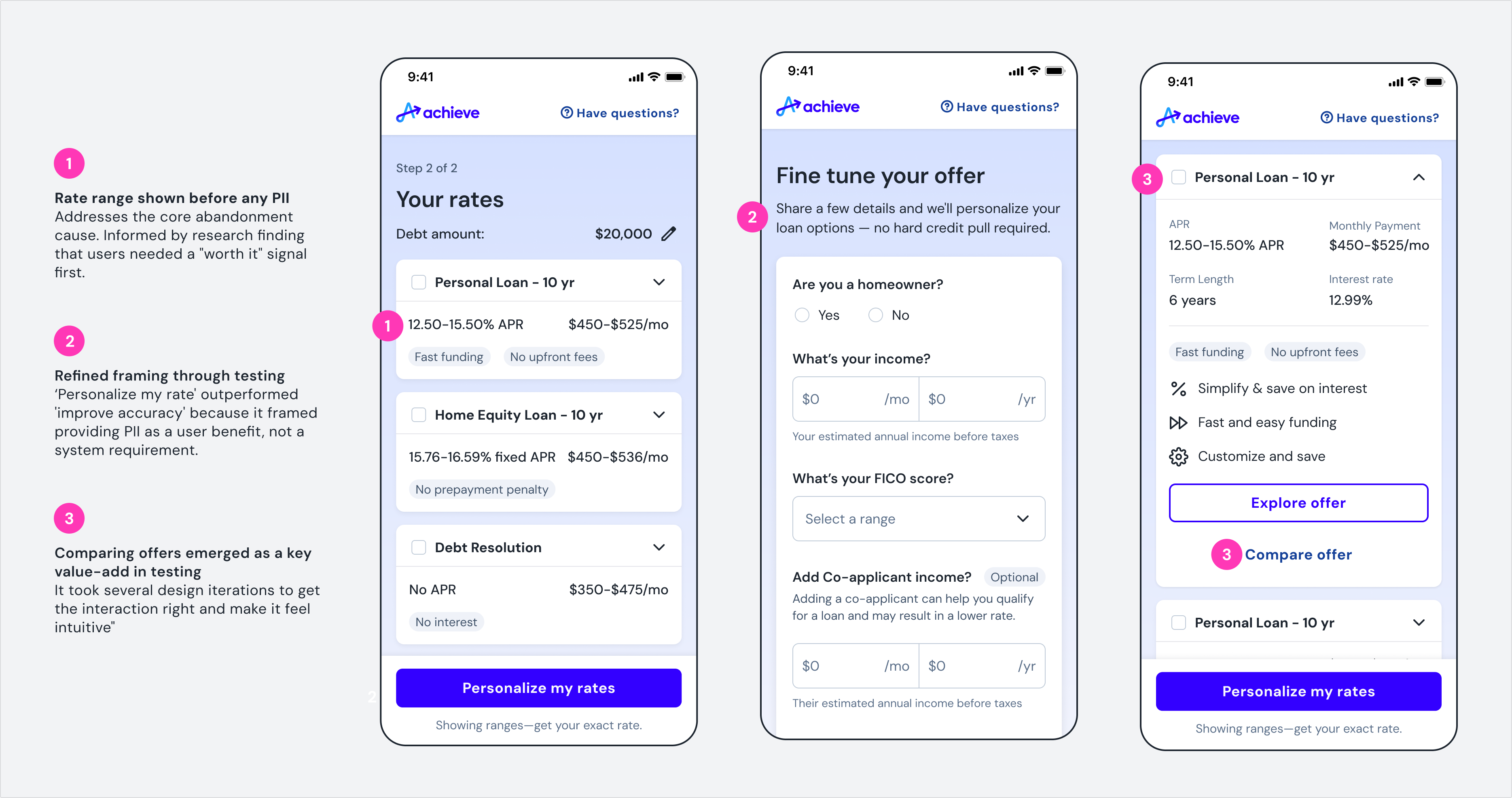
A rate explorer, no PII required
Providing a ballpark of ranges and offers upfront, before asking for any PII, means we can meet a key consumer need that no one else in the marketplace is meeting.
A user can then refine rates by providing any financial information they are comfortable providing. The experience of exploring loans is transformed into a conversation, rather than an interrogation.

Reduced abandonment = increased revenue
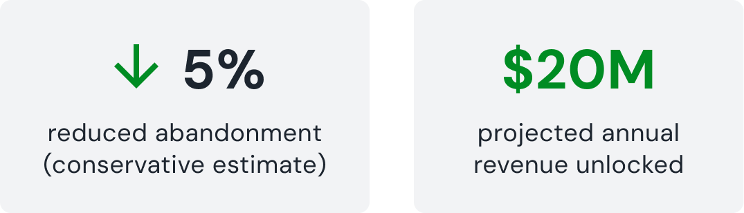
The projected revenue increase is based on current funnel volume, the A/B test's 90% preference signal, and modeled improvement to conversion rate at the entry point. MVP is in active development — I'll update this with live results once launched.